


Workspace Booking
Top 4 hacks to create great interactive floor plans


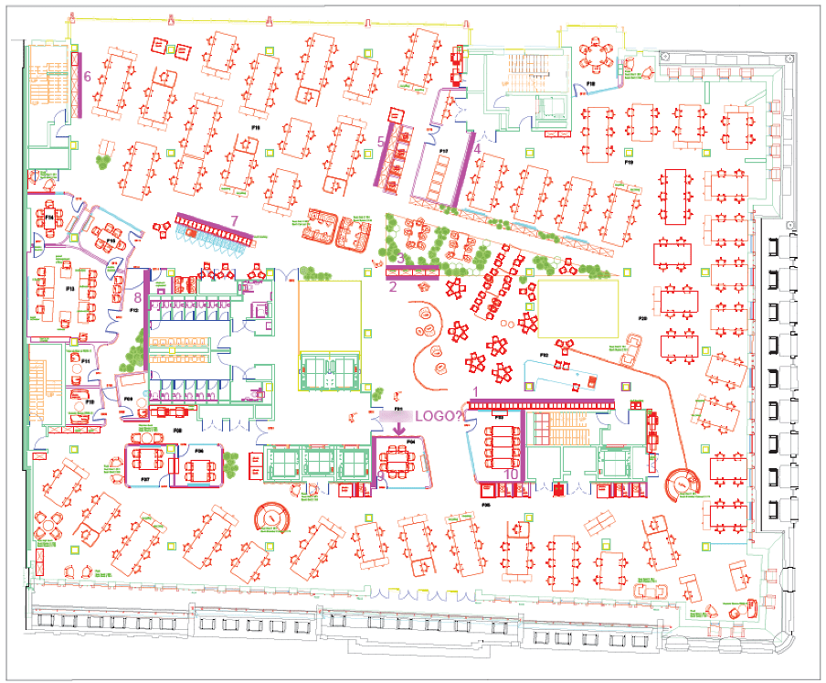
What is an interactive floor plan?
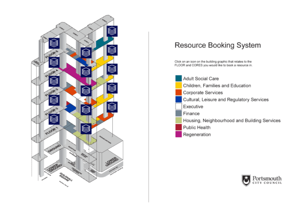
Most desk booking systems allow workspaces to be booked directly from an interactive floor plan.
Interactive floor plans are graphics that depict your office layout and are typically navigable via location, floor, or area hierarchy, using familiar pinch and zoom, point-and-click actions.
They are combined with an interactive element that uses colour-coded ‘hot spots’ or ‘pins’ to show the free/busy status of each bookable workspace on the floor plan, for a specified date and time.
Clicking on an available workspace allows a booking to be made directly into the system.
In short, interactive floor plans are a great way of doing things, as they give your workforce at-a-glance visibility of:
- what workspaces are available,
- where the workspace is located and what facilities are nearby, and
- an immediate and convenient user experience.
Depending on the system you choose, interactive floor plans can show the location of specified co-workers (allowing to you book a desk nearby). They can also show the current location of, say, a first aid contact.
Want more expert advice?
Why it’s important to invest time and energy into your floor plan design
At Essential we believe that great-looking floor plans is a valuable part of any hybrid working strategy.
Aside from making it as easy as possible to make workspace reservations, floor plans offer a valuable opportunity to convey the various considerations you’ve made to help an office visit both comfortable and productive for your workforce.
This might include health and safety facilities, wellbeing rooms and new collaboration and personal storage facilities.
If your office has been re-worked, or you have new starts joining the company, well-designed floor plans will also help your workforce quickly familiarise themselves with key facilities, enabling them to locate the optimum workspace and resources for their visit to the office.
Perhaps they need to do some photocopying, perhaps they want to socialise or, conversely, they might need a quiet space in which they can focus.
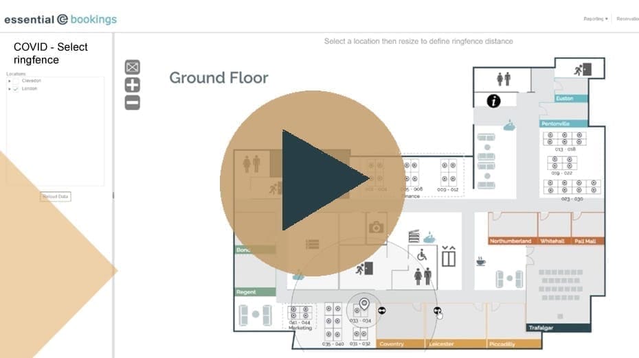
Regardless of which system you use – or even if you simply want to use printed maps in your reception/lobby areas – here’s our top tips on how to create the best floor plan graphics to use as the basis of your workspace booking system:
1. Consider your floor plan orientation
The starting point for creating your floor plans is typically to use existing CAD diagrams, but before you go any further, check that they will be ‘the right way up’.
Architectural plans are typically orientated in relation to true north or ‘project’ north.
The industry convention used for mapping shopping malls, public spaces etc., however, is to have the main entrance of the office building or space at the ‘bottom’ of the floor plan, and with any other entrances clearly labelled– e.g., Car Park Entrance.
Given that most bookings will be made remotely, it’s useful to orientate your floor plans according to the most typical ‘end user experience’ of entering the office space. So everything that’s on the left of the map viewed from your desk, is on the left when you enter the office space ‘in person’.
Also bear in mind that whilst the facilities team will be very familiar with existing CAD diagrams, re-thinking their orientation can give a better overall way-finding experience – especially for new starts that may have never entered your office until now.
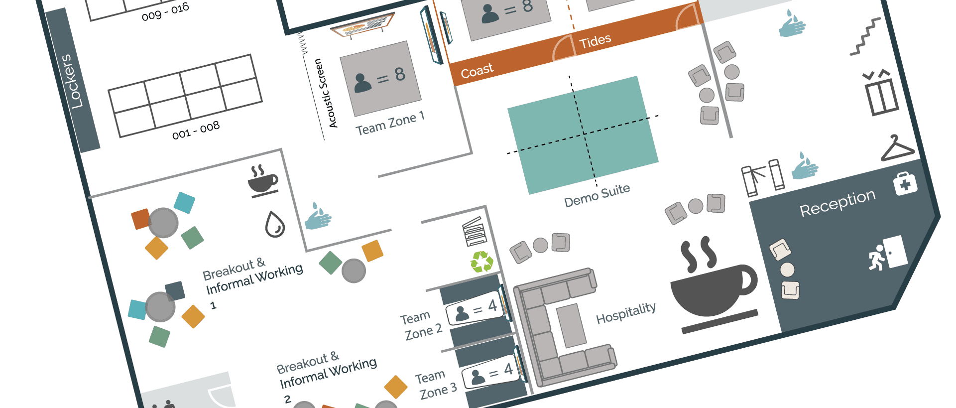
2. De-clutter & focus on what’s important
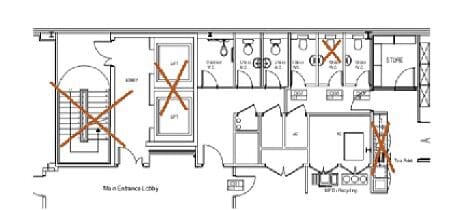
Architectural diagrams are typically overly complex and include detail that’s simply not relevant, such as plumbing and sanitary hardware, risers, and broom cupboards.
Even walls and windows tend to be represented by multiple lines, when just one line would suffice. Similarly, chairs, screens on desks, etc, can be made up of many different lines and shapes.
The level of detail included can make your floor plans difficult to assimilate ‘at a glance’. It can also create accessibility (WCAG) issues.
In our floor plan service, we always remove unnecessary elements and replace them with simpler symbols and lines to improve the UX and the efficiency of the map.

Here are our tips for simplifying your own maps and making them better for hybrid working:
Focus on the basics
Drop the details and leave behind just the components and way-finding elements that will help your workforce select, and then later locate, their chosen workspace such as:
- Entrances, lifts, staircases & fire exits
- Coffee areas
- WCs
- Sanitising stations
- Accessibility facilities
- Storage lockers
- Standing desks, quiet areas, huddle spaces
- Video conferencing rooms
Use icons where possible
Instead of drawing every cubicle in the loos, just use the relevant symbols. Plus, there’s no need to use a legend for your floor plans if your chosen symbols use standard and recognisable conventions.
Redraw from scratch
CAD diagrams can be large and difficult to optimise for your desk booking system. This is especially the case if vector graphics (e.g., SVG files) are required.
For the smallest file sizes and cleanest results, be prepared to trace over your CAD floor plans using a vector package such as Adobe Illustrator or Inkscape (available free online).
Before:
After:

3. Use artistic licence
Just like the award-winning design for the London Underground map, helping your workforce choose and then find their booked workspace when they arrive in the office does not demand a slavishly accurate rendition of your actual floor plan.
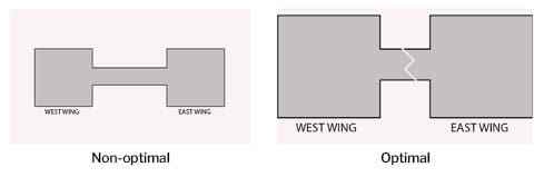
To ensure workspaces are shown as large as possible and to minimise zooming in, we recommend you make the most of your available ‘screen size’. For example:
- Using ‘artistic licence’ to shrink spaces that are not ‘bookable’, such as long connecting corridors. This will help you scale up your floorplans without losing relevant information.
- Removing unnecessary borders and architectural annotations so that your floorplan fills the available ‘screen space’.
- For larger office areas we recommend dividing the floor space up into zones – e.g., North, South, East & West. These can then be selected from the workspace booking navigation panel.
If there is a strong design element to your office, then reflect this in your diagrams to aid familiarity.
For example, you might use navigation aids such as:
- Reflecting the different coloured carpets used in each zone
- Labelling ‘external landmarks’. For example, a customer in Canary Wharf wanted to help staff navigate by depicting the view out of each window into their floor plan (i.e., HSBC, the O2, etc)
- Picking up on décor such as different coloured meeting rooms.
4. Apply a desk numbering scheme to your floor plans and to your actual desks
Many of the customers we work with that are implementing desk booking systems don’t already have a desk numbering system.
If you already have numbering, it may well be out of date and include ‘out of sequence’ numbers that have been added to accommodate change over time.
A new workspace booking system is an ideal opportunity to re-label your floor plans AND your physical workplace to ensure the optimal experience for end users.
This subject is a whole new conversation again, see our article on Best practices for desk numbering.