We help Microsoft-centric enterprises fully adopt the cloud & adapt to new ways of working.
Essential Solutions :
Get essential updates instantly! Subscribe
Female editing a SharePoint design

SharePoint Design

Tips to Help Maintain Your Brand in SharePoint

When it comes to your corporate intranets, the use of carefully selected and strategically placed images can greatly enhance the user experience and showcase your corporate brand.  

From our experience of working with Modern SharePoint sites, however, we know it’s challenging to maintain a consistent ‘look and feel’ – especially when the people creating and contributing to SharePoint sites are not necessarily design experts.   

Even with custom themes it’s difficult to inject all the elements of your brand palette, brand typefaces and other visual effects that make up your brand identity.

In this article we want to share some tips and tricks for working with imagery in SharePoint Online that will deliver the most user-friendly and ‘on-brand’ experience. 

By following these recommendations, you can ensure that your intranet reflects your brand’s identity while providing an engaging and visually appealing experience for users. 

1. Curate a large, ‘on-brand’ image library for SharePoint 

If you leave individuals to source their own images, you’ll soon find yourself with a mishmash of styles and designs that not only frustrate your marketing team but also create an unprofessional and disjointed overall appearance. 

You also risk using images that are not properly licenced for your enterprise to use. 

By pre-empting the different images your organisation will need and creating an extensive ‘image library’ they can dip into, individuals will be less likely to go off-piste, and the overall look of your SharePoint sites will be maintained. 

2. Combine photos with vector graphics 

We know by experience that it’s difficult to source wide repertoire of ‘relevant’ and ‘topic related’ photographs.

Plus, if you don’t have an in-house photographer, over-reliance on purchased stock images can look false.  Let’s face it – we don’t all look like models – and this ‘non-realistic vibe’ may be inappropriate.  

There are a few other issues that come with using a lot of photographs: 

  • Things quickly start to look ‘samey’.  
  • The tinted shading (vignette) used as a text backdrop in the ‘Hero Tiles’ image option isn’t great over ‘busy’ photo backgrounds. 

Below is an example too many photos – they start to look confusing….:
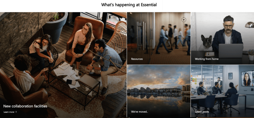
Simple line art images are a lot easier to assimilate visually and act to visually ‘break up’ the content, providing visual relief and enhancing readability within SharePoint pages.

Plus, the fact that you can create them in an array of dimensions and on-brand colourways, makes them a great way to ‘inject’ your brand colour palette into SharePoint with minimal effort.

Below is an example of combining photos with vector graphics – things look a bit clearer.
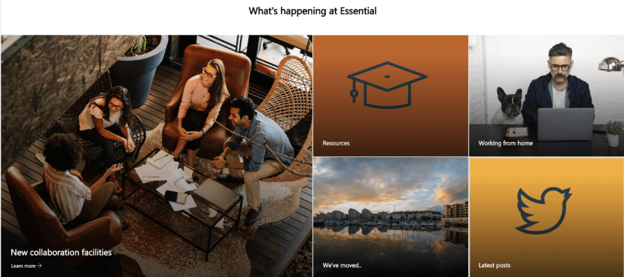
The other great thing about using vector graphics is that can also create them in bulk using applications like Adobe Illustrator or Canva. Icons and vectors – including collections of vectors that have the same look and feel – are also available at low cost from platforms like FlatIcon and FreePik

Our tips:

  • ‘Personalise’ stock images by adding ‘treatments’ that match your brand effects
  • Instead of struggling to find the perfect photo – use vector or Icon-based images. 
  • Aim for a consistent look and feel, i.e., try to be consistent with characters, proportions and effects (e.g., flat, Isometric, 3D, hand-drawn – not a mix of all these!).
  • Re-colour vectors to reflect your brand colours.
  • Consider using the same vectors in different colours from your brand palette – perhaps different departments can use a different colourway….
  • Sometimes a simple icon on a background that uses the visual elements of your brand can look really impactful.

3. Consider image accessibility in SharePoint 

There’s many ‘baked in’ aspects of Modern SharePoint that aid accessibility. Here’s some tips to make sure the images you use also deliver the best experience for all, including those with visual disabilities.

Check Your Image Colour Contrast: If you down the route of creating your own line-art image as recommended above, ensure there’s a strong contrast between the text and background colours. This helps users with visual impairments or colour vision deficiencies. 

A contrast ratio of 3:1 = minimum level is recommended by [ISO-9241-3] & [ANSI-HFES-100-1988]. You can check your chosen colours using this online tool.

Use Descriptive Alt Text:  Another failsafe to help with accessibility is to provide a meaningful and descriptive alternative text (alt text).  

To help with this process, there’s a ‘suggested alt text’ that pops up when you insert and image into a page.   You can obviously edit this to suit. 

The alt description gets put into the HTML image description ‘behind the scenes’ to be used by whatever system the viewer is working with – e.g., to read the ‘Alt text’. 

Of course, this means anyone adding images will need to check and edit the alt text as required for the ‘use case’.

Side Note: At the time of writing this article it’s not possible to pre-define the alt text in your SharePoint image library.  This is probably because it’s considered not good practice to take a blanket approach to ‘alt text’ as the context in which the image is used will have an impact on the meaning of the image (and therefore the ‘alt text’ that should be used). 

4. Maintain high quality images

Use reasonably high-resolution images to maintain image quality, but not too big that page load times are impacted.

Here’s a link to a table that provides the optimal sizes and aspect ratios for images in SharePoint.

5. Understand the ‘image options’ in Modern SharePoint 

The image options in Modern SharePoint are constantly evolving and each option has its own nuances.

Images are typically applied using what’s termed a ‘web part’, the following of which are available in Modern SharePoint: 

  • The Hero Web Part 
  • The Image Web Part 
  • The Image Gallery Web Part 

You can also select to use images in these areas: 

  • The Quick Links Web Part. 
  • SharePoint page titles. 

Each of these ‘image options’ work in slightly different ways, and it’s worth familiarising yourself with their unique behaviours and customisation possibilities. 

Hero Layout Examples: 

The Hero Layout is often used on the site ‘home page’. 

It offers an impactful, full width, ‘no gaps’ image layout that’s available in both a ‘Tiles’ and a ‘Layers’ format.  When you set up a new site you will see a default Hero is used on the ‘home page’.

The ‘Tiles’ Hero comes in 5, 4, or 3-part variants and can comprise images with white text overlaid on a black vignette, or plain boxes with text (referred to as a colour block). 

The ‘Layers’ Hero option lets you have up to 5 layers, where each layer is made up of an image and an informational text box (featuring black text on a white background or vice versa depending on your theme selection). 

Each hero ‘part’ can be associated with a link to another page, although this step is optional with the Tiles Hero – more on this later.

Here are our ‘tricks and tips’ for getting the most out of Hero Graphics

  • Use Heros with mix of photographic and line-art based imagery (see point 2.)
  • If using the Hero Tiles option, consider making your image darker at the bottom and/or reducing the contrast in your image to enhance the legibility of the overlaid text.
  • Although the ‘Colour Block’ can help break up photos, this option is limited to using just the one primary colour from your site theme. By creating simpler icon-based images that incorporate a range of your brand colours (see point 2), you can side-step this restriction. 
  • Don’t use too many Hero Layers – you’ll end up making users scroll too much to see everything that’s on offer – see also point 7.

Regular Image Examples 

Regular images applied using the Image web part can be square (1:1) or rectangular in either a 4:3 or 16:9 ratio. See this table for recommended sizes. 

Below is a 3-column ‘regular’ image layout with a 1:1 aspect ratio graphic.  

Example of a 3x2 SharePoint page that uses the regular image web part

As you can see in the above example, this image web part lets you add a text in a black bar (recently changed to be a black bar with a slight transparency) over the image.  This offers better accessibility than the vignette applied in the Tile Hero. 

Note that you can’t get rid of the white borders (gaps) between ‘regular’ images.  The ‘no gap’ effect is only available with the Hero web part.

Here are our ‘tricks and tips’ for getting the most out of the regular Image web part

  • Although it’s possible to crop and resize your graphics using the SharePoint image editor, if you want to get your images to line up consistently (e.g., when used ‘side by side’ in a section), we advise you start with images that have the same dimensions.  
  • As with the Hero option, mixing photographic images with simpler vector graphics offers the best user experience.
  • We recommend limiting the number of images used to no more than 9 (if using a 3 x 3 layout) to get the best UX – more on this later.

The Image Gallery Web Part 

If you want to show many images in a more compact space, the Image Gallery may be an option.

This web part lets you display multiple images in (currently) 3 different layouts (a grid, brickwork and carousel layout). 

You can select images manually or specify an existing document library to automatically pull images from.  The web part will automatically sort out the formatting according to the layout you specify. 

To be honest, the fact you can’t associate a link with these images makes it of limited use – see also point 6. 

Our tip here is to use the Quick Links Web Part instead of the Image Gallery and opt to use a Custom Image as a thumbnail. 

Note also the Quick Links Web Part gives you the option of selecting small icons from a library in SharePoint.  The number of default icons available are increasing all the time. 

Example of using SharePoint quicklinks with on-brand imagery

6. Limit reliance on linked images for SharePoint navigation

This brings us onto another point: Images are great for putting a spotlight on important or new content and making your web site fresh and appealing. We would, however, recommend that images are not over-used for core site navigation.  It’s best to use the menu for this.  

Also, bear in mind that images can take up a lot of screen real-estate, and require the user to scroll down ‘below the fold’ to see everything that’s available.  As a result, end users may not see all the available options. 

The 5-layer Hero is perhaps to be avoided for this reason. 

The Quick Links Web Part is a much better option for getting more images ‘at a glance’ and in a compact space.   

Also bear in mind that too many images can clutter your design and make it difficult for end users to find what they’re looking for.  Once you have more than 9 images (i.e., 7+2) you are more likely to hinder than help users to navigate your site.   

7. Be careful with images used for SharePoint titles 

Each new page you create in SharePoint – unless you opt for the ‘Plain’ variant – offers the opportunity to use a wide format or ‘panoramic’ image that sits alongside page title.  

For a title image, your image size should ideally be a minimum of 1920 wide and 300 pixels in height, however getting title images to work well visually, creates its own new set of challenges.

8. Develop a Mini Brand Guide for SharePoint 

Whether you’re adhering to your corporate brand guide or creating a distinct ‘internal’ brand for different departments, functions, or sites, it’s valuable to establish a SharePoint-specific mini guide. This guide should outline essential aspects such as:

  • The importance of using on-brand images in SharePoint
  • Guidelines for navigation, including the use of images, text, and menu links
  • Your preferred image layouts using web parts (e.g. Hero Tiles and not Hero Layers)
  • Instructions on where to find on-brand graphics (see point 10)
  • The importance of maintaining accessibility and how to use ‘Alt Text’
  • Contact information for requesting new graphics

This guide should also include guidance on the desired ‘tone’ of site ‘textual’ content, i.e., whether friendly or more formal writing style is recommended.

9. Make it easy for SharePoint contributors to find your images 

Image anarchy in SharePoint often sets in at the point at which site contributors select an image.
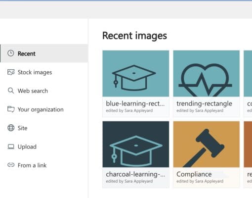
As you can see from the above screen shot, the editor has a range of options via which they can get hold of an image, so it’s vital you explain where to find ‘brand legal’ graphics.

Look out for the next blog article in this series that explains how you can publish on-brand images across all your SharePoint sites using an Organisational Asset Library.

Conclusion

For many businesses adopting a remote or hybrid workplace, intranets like Microsoft SharePoint have become the next best thing to the physical workspace. 

Investing effort into creating a ‘visual wrapping’ that represents your corporate brand and keeps your sites appealing is therefore a worthwhile exercise.

A stunningly designed intranet means little if it remains stagnant and fails to offer fresh content. Without regular updates, employees will lose interest, leading to an ineffective intranet.

Discover the importance of creating a great intranet experience when onboarding new starts

Getting the right individuals to take ownership of the various intranet services and portals – and arming them with the relevant resources (such as on-brand images) – is essential to keeping the experience dynamic and employees coming back for more. 

Super-charge your SharePoint sites

Essential offers a range of SharePoint services, including migration, SharePoint configuration and design, image curation and brand-led design services.