


SharePoint Design
SharePoint Image Layout Options


The image layout options in Modern SharePoint are constantly evolving and each option has its own nuances.
Images are typically applied using what’s termed a ‘web part’, the following of which are available in Modern SharePoint:
- The Hero Web Part
- The Image Web Part
- The Image Gallery Web Part
Discover how to keep your SharePoint looking ‘on-brand’ with clever use of imagery.
You can also select to use images in these areas:
- The Quick Links Web Part.
- SharePoint page titles.
- NEW – The ‘Flexible’ section – more on this later in another post.
Each of these ‘image options’ work in slightly different ways, and it’s worth familiarising yourself with their unique behaviours and customisation possibilities.
Hero Layout Examples:
The Hero Layout is often used on the site ‘home page’ and when you set up a new site you will see a default Hero is used on the ‘home page’.
The Hero offers an impactful, full width, ‘no gaps’ image layout that’s available in a ‘Carousel’, ‘Tiles’ and a ‘Layers’ format.

- The ‘Carousel’ Hero is great for maximising the ‘real estate’ on your SharePoint home page and allows up to 5 ‘rotating’ images to be used, along with different stylings.
- The ‘Tiles’ Hero comes in 5, 4, or 3-part variants and can comprise images with white text overlaid on a black vignette, or plain boxes with text (referred to as a colour block).
- The ‘Layers’ Hero option lets you have up to 5 layers, where each layer is made up of an image and an informational text box (featuring black text on a white background or vice versa depending on your theme selection).
Each hero ‘part’ can be associated with a link to another page, although this step is optional with the Tiles Hero – more on this later.
Here are our ‘tricks and tips’ for getting the most out of Hero Graphics
- Use Heros with mix of photographic and line-art based imagery (see point 2.)
- If using the Hero Tiles option, consider making your image darker at the bottom and/or reducing the contrast in your image to enhance the legibility of the overlaid text.
- Although the ‘Colour Block’ can help break up photos, this option is limited to using just the one primary colour from your site theme. By creating simpler icon-based images that incorporate a range of your brand colours (see point 2), you can side-step this restriction.
- Don’t use too many Hero Layers – you’ll end up making users scroll too much to see everything that’s on offer – see also point 7.
Regular Image Examples
Regular images applied using the Image web part can be square (1:1) or rectangular in either a 4:3 or 16:9 ratio. See this table for recommended sizes.
Below is a 3-column ‘regular’ image layout with a 1:1 aspect ratio graphic.

As you can see in the above example, this image web part lets you add a text in a black bar (recently changed to be a black bar with a slight transparency) over the image. This offers better accessibility than the vignette applied in the Tile Hero.
Note that you can’t get rid of the white borders (gaps) between ‘regular’ images. The ‘no gap’ effect is only available with the Hero web part.
Here are our ‘tricks and tips’ for getting the most out of the regular Image web part
- Although it’s possible to crop and resize your graphics using the SharePoint image editor, if you want to get your images to line up consistently (e.g., when used ‘side by side’ in a section), we advise you start with images that have the same dimensions.
- As with the Hero option, mixing photographic images with simpler vector graphics offers the best user experience.
- We recommend limiting the number of images used to no more than 9 (if using a 3 x 3 layout) to get the best UX – more on this later.
The Image Gallery Web Part
If you want to show many images in a more compact space, the Image Gallery may be an option.
This web part lets you display multiple images in (currently) 3 different layouts (a grid, brickwork and carousel layout).
You can select images manually or specify an existing document library to automatically pull images from. The web part will automatically sort out the formatting according to the layout you specify.
To be honest, the fact you can’t associate a link with these images makes it of limited use – see also point 6.
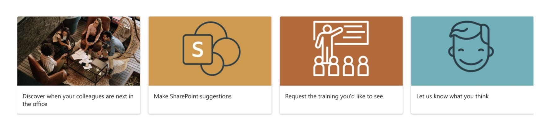
Our tip here is to use the Quick Links Web Part instead of the Image Gallery and opt to use a Custom Image as a thumbnail.
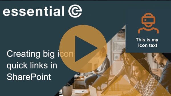
Note also the Quick Links Web Part gives you the option of selecting small icons from a library in SharePoint. The number of default icons available are increasing all the time.
TIP – Limit reliance on linked images for SharePoint navigation
This brings us onto another point: Images are great for putting a spotlight on important or new content and making your web site fresh and appealing. We would, however, recommend that images are not over-used for core site navigation. It’s best to use the menu for this.
Also, bear in mind that images can take up a lot of screen real-estate, and require the user to scroll down ‘below the fold’ to see everything that’s available. As a result, end users may not see all the available options.
The 5-layer Hero is perhaps to be avoided for this reason.
The Quick Links Web Part is a much better option for getting more images ‘at a glance’ and in a compact space. The new ‘Flexible’ section also lets you create much more compact imagery layouts.
Also bear in mind that too many images can clutter your design and make it difficult for end users to find what they’re looking for.
Remember the 7 plus or minus 2 rule – Once you have more than 9 images (i.e., 7+2) you are more likely to hinder than help users to navigate your site.
Find out more about Essential SharePoint Services
Essential offers a range of SharePoint services, including migration, SharePoint configuration and design services.


